The Cover That Never Was
The Cover That Never Was
In the spirit of Eric's new album "The APP That Never Was", I wanted to tell you the story of an album cover that didn't make it to release.
I'd been in contact with Tim Fraser-Harding about the project of re-mastering the APP back catalogue; we'd been discussing some issues such as the fan poll that was used to determine the track list for the compilations, as well as the memorabilia that was added to the liner notes. During one conversation, I'd asked if the compilation cover was going to be created by Storm Thorgerson. The answer was that it wasn't going to be Storm, but that a decision on the cover still hadn't been made yet.
Tim then asked something like, "Did you have something in mind?" Over all these years, I've thought of all sorts of cover design options, but it's amazing that when you're finally presented with the question that all those ideas suddenly go "poof". I just said that I'd think about it for a couple days and get back to him.
As an APP fan, while the music was the principle reason to follow them, the album packaging was also memorable and an enjoyable part of the experience. Over the years, Storm and his team created some classic designs from Tales to Try Anything Once. The designs not only had that trademark Storm-style, but also reflected the AP theme and quality.
Unfortunately when it came to covers for compilations, the results have not been as consistently solid. I still like the first Best Of (1983) cover, despite the fact it's a weird combination of 2D and 3D images - maybe there is something about the colour palette that appeals to me. Some have attempted to be creative: Pop Classics (1989), Best Of (1992) and The Definitive Collection (1997). In each of those cases, I'm not sure how strongly the ideas tie back to APP, but they were interesting covers. The fish tank in the Definitive Collection, is like Eve in that it appears at first as a straight forward image, but it's one you can look deeper into - through the veil and see the warts, or into the tank to analyze why those objects are there together.
More often though, the compilation covers were given little thought: some just merely using the eye symbol (Gold Collection - 1998), some were "cut and paste" jobs (Anthology -1991) and others were just press photos (Master Hits - 1999).
To me, the cover should be something that is new and unique, but at the same time reflects the style and creativity of the covers of the original catalogue. While each of the original ten APP covers were completely different, for the most part there was a strong desire to be artistic and have a solid impact.
I took a walk that day to mull it over, and along the way I passed a set of curved stairs (carved out of some kind of stone) that is part of the classic architecture of a building here in Toronto. The stairs kind of reminded me of one of the Gaudi photos used for a single sleeve. Although it doesn't appear in the final design, it got my mind working on ideas of curves, old architecture, etc., and lead to the larger question: what theme spans all ten albums?
At first you think all ten albums are unique from gambling (Card), to women (Eve) to robots, and at first there is no natural thing that unites them. But as I walked, I realized there are two things that come up regularly: time and conflict. Time: besides the obvious track titled "Time", there's the look at past, the future, but also the passage of time ("Old and Wise", "Days Are Numbers"). As for conflict, there were relationship issues, addictions, sorrow, and even robots taking over, but what I really think of is menace. In an interview years ago, Eric Woolfson talked about how some songs were too soft and didn't have that "menace". In songs like "Dr. Tarr" and "Psychobabble", the element of menace gives the song its tension and depth.
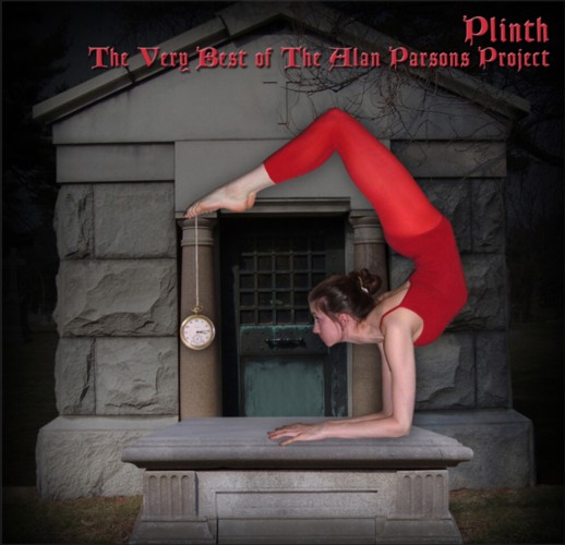
All of this resulted in the following image:
Keep in mind, that this is the test version that was submitted. Had there been interest we would have worked to clean it up. The "Plinth" title was never a title considered for the collection. It's there because we needed to test out fonts and colours; the word "plinth" refers to the stone Megan is on, and was just the working title the artist was using for the image.
Once I had the idea for the image, I knew I couldn't do it alone, so I got a hold of some people to help out. I enlisted the help of Pauline Mead to do graphics editing. Pauline not only had the tools, but had years of experience as a graphics artist. As for the model, it answered the question, "how many contortionists does the average person know?" Despite the fact that I was apparently running ahead of quota, I still couldn't find the right person. I knew the pose I needed, so I drew it out (like a stick-person), scanned it and sent it to a couple of friends. Unfortunately, neither could do that pose, but one referred me to their friend Megan McCarthy. After a few experimental shots, we got the pose used for cover.
The pose was chosen for two reasons: the first is so she is looking at the watch (watching the passage of time); the second is to be a reference to the Vulture Culture cover (the feet close to head; similar to biting the tail). Another subtle reference in the image is that the watch is set to 3:14, which is the same as the clock on the cover of Pyramid. The stonework in the image (shot in Niagara On The Lake) is a nod to photography in Tales. Overall, I think it's a provocative statement, with there being that touch of menace in there.
We worked on this in early 2006, and submitted the test version by April. Pauline had also been toying with some other ideas of her own, and you can see all of them here. My favourite two were Moral Compass and Orders of Magnitude.
While we were waiting for a decision, tragically Pauline passed away at the age of 43. After she died, I was given all of her working files and had we been given the green light, I would have found a way to get the image in a final format. Once things went in a different direction, the files were shelved and it was never completed.
Putting aside any critique on the images that were chosen for the series of compilations ("Dutch", "Days Are Numbers" and "Essential"), given what happened I was hoping one of Pauline's images would have been selected so they would be a legacy to her.
While you'll probably never see any of these images in a record store, I'm glad that you finally get the chance to see what Pauline and I were working on.
Enjoy!
Steve Martin - March, 2009
All images Copyright 2006 - Steve Martin (Plinth) and Pauline Mead (all except Plinth)
This page, copyright 2009 The Avenue / Avenue Communications.